

Presenting, Documenting and Exploring Visually
At the start of every bikablo® basics class, we talk about what bikablo is and how it is different. Most people who attend our classes have ‘no drawing skills’ and are worried about their lack of drawing ability. At the end of two days, they are consistently surprised with the dramatic change in their ability to visualise. The reason for these results is that bikablo is a systematic approach to visualisation. In bikablo, we say that ‘visualisation is not about art, it’s about language’. And just like any language, the goal is about communicating meaning. All languages do this because they have systematic grammar, syntax and cultural nuances that allow people to have shared understanding of what is being communicated. Just like the languages we speak in, bikablo is a systematic visual language. It has letters, words, grammar and syntax that can be combined and recombined in different ways in order to communicate content in a way that is meaningful to its audience and their surrounding context.


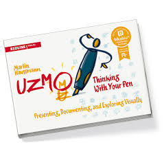
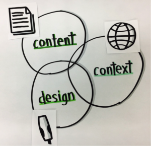
In his book, ‘UZMO’, bikablo co-founder Martin Haussmann provides a simple but very powerful framework for understanding, and using, visualisation as a language. It has three basic elements, that I like to represent as a Venn Diagram:
When I communicate this idea at the beginning of a class, it’s always greeted with a few nods and a few puzzled expressions. But as we gradually build in each layer of the technique and apply it in practice, I return to this framework as a way to plan and then execute our visualisations. Through this journey of theory and practical experience, the penny drops on what this framework means and how it can be used in practice. Let me give you a simple example of how I used this recently.
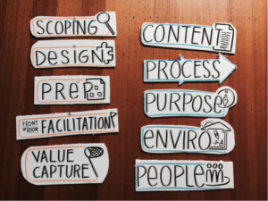
I was designing a 2-hr class on how to design and facilitate collaborative meetings and workshops. There would be 32 students who were coming after work and would be seated in a ‘cosy’ classroom for 2-hours. My presentation was largely based on a slide deck I had created but was organised around two frameworks that would gradually be revealed. The students would need to hold the frameworks in their mind as we progressed through the slide deck. I would need to be able to refer back to the frameworks throughout the class. I needed to create ‘signposts’ for each part of my content that would help the group remember the frameworks as I talked to them. I also needed people to be able to see the signposts from the back of the room.
Finally, this was a class that I planned to offer multiple times, so I needed re-usable content.
The 5 key jobs of a facilitator
The 5 key design elements of any collaboration session
Overall there were are two frameworks each with elements, so 10 content elements overall.


As you can see from the images, I created 10 physical signposts which we call ‘mobile elements’ in bikablo®. I used bold, visible lettering with an icon or container around each to anchor the meaning of each piece of content. I also used two different colours to delineate the two different frameworks. I used foam board (or foam core) for two reasons. Firstly because its smooth white surface really takes well to markers without bleeding. Secondly it is a light, stiff and relatively durable material which would last longer with repeated use.
This is a simple example, but the framework is scalable to larger, more complicated visualisations, and indeed, to any form of design work more generally that involves content that must be communicated in a way that can be interpreted in a way that fits a particular context.
Join us at one of our upcoming 2-day classes to learn more about this framework and how to use it in practice.

The article was written by Natalia Tsygankova. Natalia has always loved words and talking to people. She has put that passion to good use and has been sharing people’s stories in the community radio, TV and print media for the last 10 years. Natalia is also a big fan of true storytelling events and regularly volunteers at the most famous one – The Moth, interviewing the winner. You can hear her own story of moving to Australia from Russia in 1999 here. Natalia believes that everyone has a story – So what’s yours? Contact her today to share your story.

